So I’ve been reviewing graphics made by various people and businesses and thought it’s about time I make a blog on how to use fonts. This is just a general rundown on what type of fonts you should use, healing what fonts you shouldn’t use, and when to use certain fonts. I personally use Canva to create my graphics, so I’ll be referring to some fonts specifically from Canva.
Side Note: If you do not have a Canva account, go create one now!
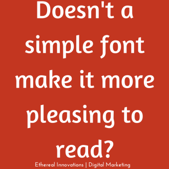
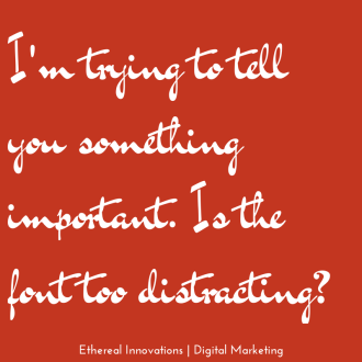
Let’s start off with an example of what not to do. For one, if your graphic contains a message you want to get across, please use a simple font. If you use a font that has too much going on it will make it harder for your audience to read it, if they even take the time out to decipher whatever you are trying to tell them.
Fun fonts should be used to place emphasis on a word, not to relay an entire message. Take this for example:
You wouldn’t want the entire quote to be in the same font that the word ‘dreams’ is in because that would ruin the graphic.
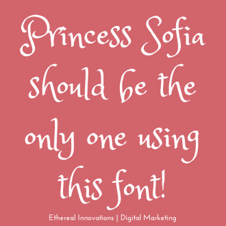
Another thing to take note of is that some fonts, whether you are trying to relay a message or emphasize one word, should not be used! Fonts like ‘princess sofia’ are prime examples of this (unless, of course, you need it for the title of your cinderella story). There are just some fonts that should only be used on certain, rare occasions.
Here are some more examples of those types of fonts:
You should be able to use your good judgement on the rare times these fonts should be used. For the most part, stay away from fonts like this in your graphics.
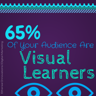
One last helpful tip I have for you is to use fonts that contrast for fun facts, or when placing emphasis on certain words. When you use contrasting fonts make sure the contrast is noticeable. You want the fonts to be different in size, weight, and style. If there is little contrast, it pretty much defeats the purpose of what you intended to do.
If you have any other helpful advice please comment to let us know.
Latest posts by Alexis Edney (see all)
- Farewell Marketing Advice From An Intern - July 24, 2014
- Elevator Etiquette - July 24, 2014
- Your Guide On How To Use Fonts In Graphics - July 21, 2014
About us and this blog
We are a digital marketing company with a focus on helping our customers achieve great results across several key areas.
Request a free quote
We offer professional SEO services that help websites increase their organic search score drastically in order to compete for the highest rankings even when it comes to highly competitive keywords.
